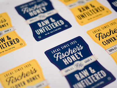
Fischer's Honey Test Run
I've always been fascinated with the role of scale in design. We ordered this test run of labels for the Fischer’s Honey bottle label design to see it in real life and analyze each design component for its scale. Context was key for us in ironing out the little details like scale and how it will read on the shelf. We rely a lot (obviously) on digital mockups to inform decisions, but seeing tangible prototypes like this is a really special way to connect that design to reality.
More by CrateBind View profile
Like

