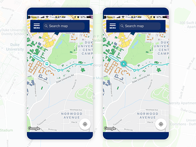
Bus Route Icon Exploration
I'm consulting with the Duke Mobile team to provide UI and UX recommendations for new features. Right now we're working on integrating bus routes & time data into the app instead of linking off to a 3rd party browser-based site.
I've looked a few dozen icon options and landed on these two as my favorites. There's a reason the pointer is most commonly used, it gives a sense of direction even when the bus is not in motion. So that's what I'll likely give as my final recommendation, but the bus icon (from the Material Design library) was fun to experiment with.
More by Jen Hubbard View profile
Like
