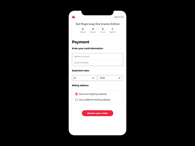
UI/ Credit Card Check Out
Redesigned the payment page of Magic Leap. Here's what I learned from UX point of view:
1. The label goes above the form field. Clean up the inside of it as much as possible.
2. Group the fields with relevances
3. Minimize the information in the form. for example,
- Show the year and date instead of saying "Select year"
- Do not slice data fields like first name and last name.
- Do not capitalize on every word.
More by Mia Lim View profile
Like
