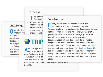
Drop Cap
I recently got into improvements and adding some touches on my portfolio website, so I can review my whole website structure. The last few months had been deep coding and designing both in and out of the text editor. So it felt nice to make a review of the code structure. Everything looks nice and tidy 🤓
So decided to add a visual touch the famous Dropcap to some places across the UI. The Dropcap had been around for centuries so it is a common design accent. 📖
The top (ascenders) and bottom (descenders) spacing of every Dropcap was solved with selecting the empty space with :before and :after the content inside our drop cap and using the negative margin to shrink it. Which worked quite nice.
**Also just a few more lines of css to the media queries, to make it more attractive on mobile which you can check on the video or just by going to www.boriskirov.com

