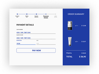
Daily UI | Challenge #2 | Credit Card Checkout
Hello!
The UI Daily Challenge of the Day 2 was a credit card checkout.
My process through the creation of the design was:
- Understand the process of buying something in e-commerce.
- Mapping the steps to conclude the shopping with success
- Understand the information that is necessary to be present in the interface, when we inform the credit card details
So the result was:
- The checkout presents 5 milestones with all the steps to realize the shopping.
- The white box shows just de information necessary to be filled at that moment.
- A box shows the products selected in e-commerce.
The color choose was blue, inspired by the products in the checkout that have a premium look.
My problem was the chose of the colors... and make the typography pair with the colors an provide a good reading.
This was the final result, it was necessary approximately 5 hours to finish this challenge.
I have a lot to improve and need to dig deeper into the color theory and typography study.
