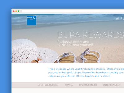
Bupa Reward - Web UI
Sometimes, simply creating a system or solution and then rushing to market is a good way to get exposed but not a good way of retaining a user-base. Bupa took a step towards trying to ensure that their rewards portal was accessible, easy to use and representing all the company tries to reflect in its mission. That's where I came in helped Bupa create User Research strategies, the creation of wireframes simple visuals, which then progressed to the high-fidelity user interface visuals and eventually, moved onto development.
More by Anmol Nandha View profile
Like


