Zara Website Redesign
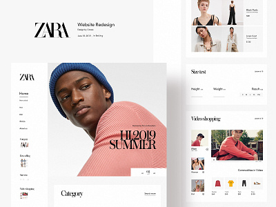
Website Redesign: due to users' using the scene, the number of users on the web side is much less than that of the app, but still better than that of the app in terms of visual scene, and hence able to imagine more in terms of function and interaction. Redesigned this time added a thumbnail of the page function section in the left navigation, users can click to quickly jump to view their content; At the same time, lock the navigation bar, slide the right content area to view, and always keep the user can make new content selection; New size assistant and video shopping oriented content: the traditional official website video is only used to display brand vision. If products appearing in video are added in video area, it may stimulate users to choose commodities. At the same time, multiple video are added in the module to show more contents in the area as far as possible.


