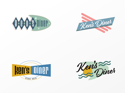
Rejected Ken's Diner logo
I was tasked to create a simple retro 50s diner style logo. It needed to be bold and reminiscent of the time and apparently this wasn't it for the committee of logo approvers.
They also had problems with using checkers, the color pink, and wondering if it was good to read from far away.
More by Sylvia M View profile
Like
