CAL Cosmetics
Hey guys! ✌️
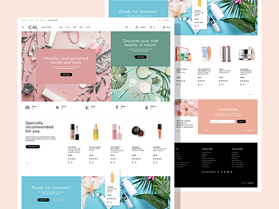
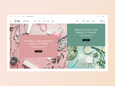
Today we want share you home page for e-commerce website CAL Cosmetics, from India.
Our goal was to create a minimalist project that will keep all ecommerce functionalities and the principles of a good UX. The big challenge was to create a project whose content will be updated by store staff who are not professional graphics.
Advertising banners are a common problem of ecommerce - everything looks good on the project, then the client makes the banners alone or with a little experienced graphic designer and the whole loses on quality. So here I used the banners where the photo is one element, and the block of text the second - this way you do not need to create graphics, just add a photo, text and set the background color of the section matching the color of the photo.
Soon more, stay tuned! 🙌
Hit "L" If you like it. ❤️
Enjoy and have a nice day! 🚀


