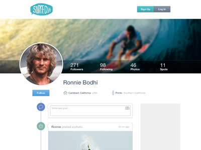
New Surfed.it Profile page
Good use of 2 hours here :) Got caught up last night on this project.
I'm soooooo drastically behind on so many things... OVERWHELMED ATM! But it's all good.
Anywho.. peep the full-size for the goodness.
Colors aren't final.. the gray area on the right is going to be a sidebar... that won't have a gray background. Alignments are probably off everywhere.. literally 2 hours here... just wanted to show y'all cause i thought it looked HAWT!
I purposefully approached this design with ONE thing in my mind: I want to use my Pictos Outlines icons for something. Then this came out :)
More by Drew Wilson View profile
Like

