Firewatch | The Great Outdoors
This week's illustration would mark my 5th illustration in this weekly series! I know it was a short game and all, but I couldn't manage to finish it but wow were the visuals memorable.
.
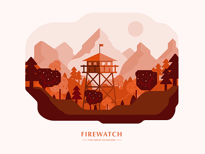
One thing I liked about this illustration is the color palette. I really like the shades of orange that melt into a dark chocolatey brown in the foreground. I especially like the color and simple shading of the mountains in the background to give the whole scene that level of perspective.
.
I think there could definitely be more detail in the trees. Have different kinds of trees as well. as well as more graphical elements and little specks on the foreground just to liven the scene up a bit.
.
I typography leaves a bit to be desired. I originally went with a typeface that was more like the actual logo but decided to switch it up to something more muted and restrained to reflect the simple geometric style of the design.
.
As always, leave your feedbacks here! Much appreciated and thanks for reading this far.
.
Say hello! Don't be a stranger: https://twitter.com/FarrelNobel