Logo Refresh
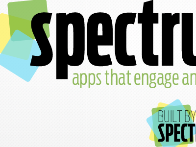
Looks like I have some loose kerning in my s-p, but moving towards an identity refresh and various implementations of said refreshments.
Hoping the app-shapes in welcoming colors as a mark combined with a strong typeface like Antenna will give us tons of combinations of material to stretch across various media, as well as communicate that we focus on multiple platforms and tightly integrating social media.
Thoughts on how to improve this or if it misses the boat?
