36 Days of Type C
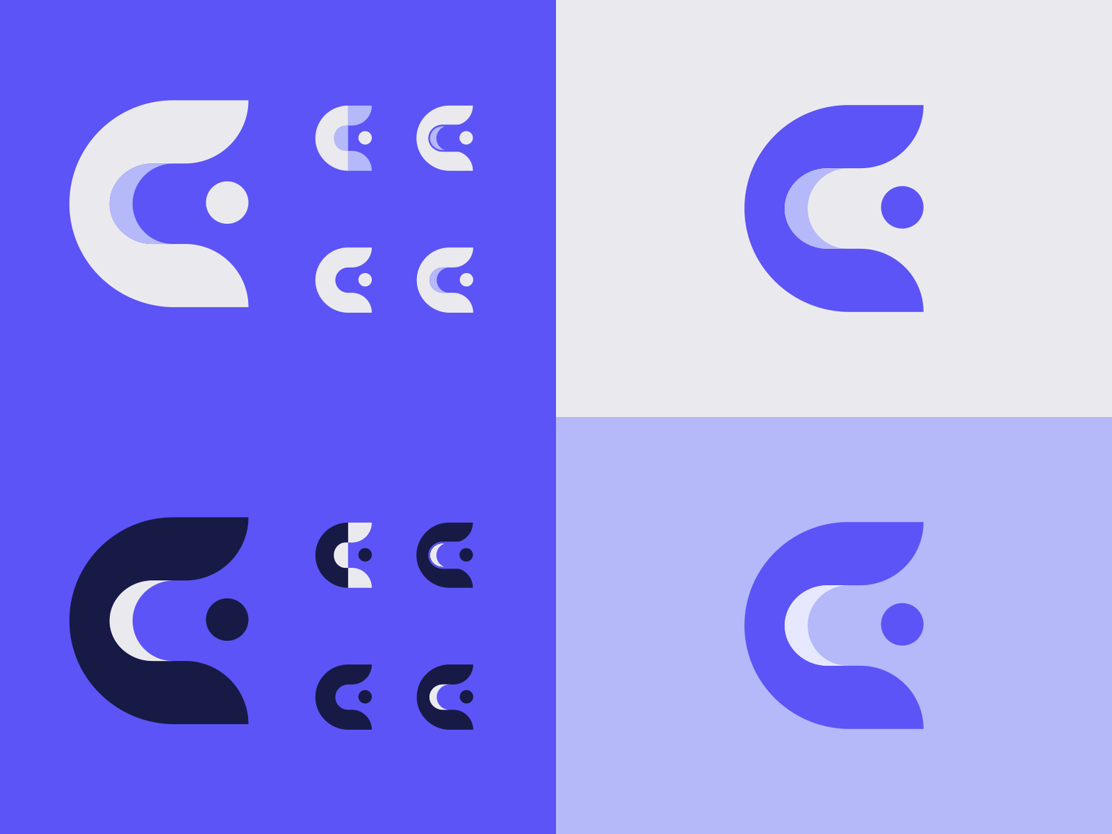
Another #36daysoftype entry. This time letter C. For this I wanted to do something curvilinear that could be used for an app or a healthcare logo. I did several iterations of this mark, but ended up liking the simplest form the best.
It's funny how much my views on adding curves to things has changed since @Adobe added that curved points tool. 5 years ago this probably would have been a few blocks coming together to form a square letter shape (my safe zone). I used to be so afraid of doing anything like this because try as I might I could never get it quite the way I wanted. Now it's so easy!
Tell me what you think! Which is your favorite?
More by Kevin Craft View profile
Like


