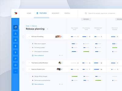
Dashboard micro interactions
Hi Dribbblers 😎
I love creating these small interactions. :)
Quick design tip #2: Small interactions
I think they should be strongly incorporated into UI, they enhance your user experience by making the user interface less machine and more human.
But also be careful with them. Don't overload UI with them nor create too complex interactions. Sometimes less is more. For example, I made these too complex. I real world I would make them much faster and direct to focus on practicality for the end user.
Do you agree?
🖤And don't forget to show me some love with "L" key. Thanks!
—
👨🏻💻 Make sure to follow me on other social networks as well:
More by Robin Holesinsky View profile
Like

