CommonBond for Business Onboarding
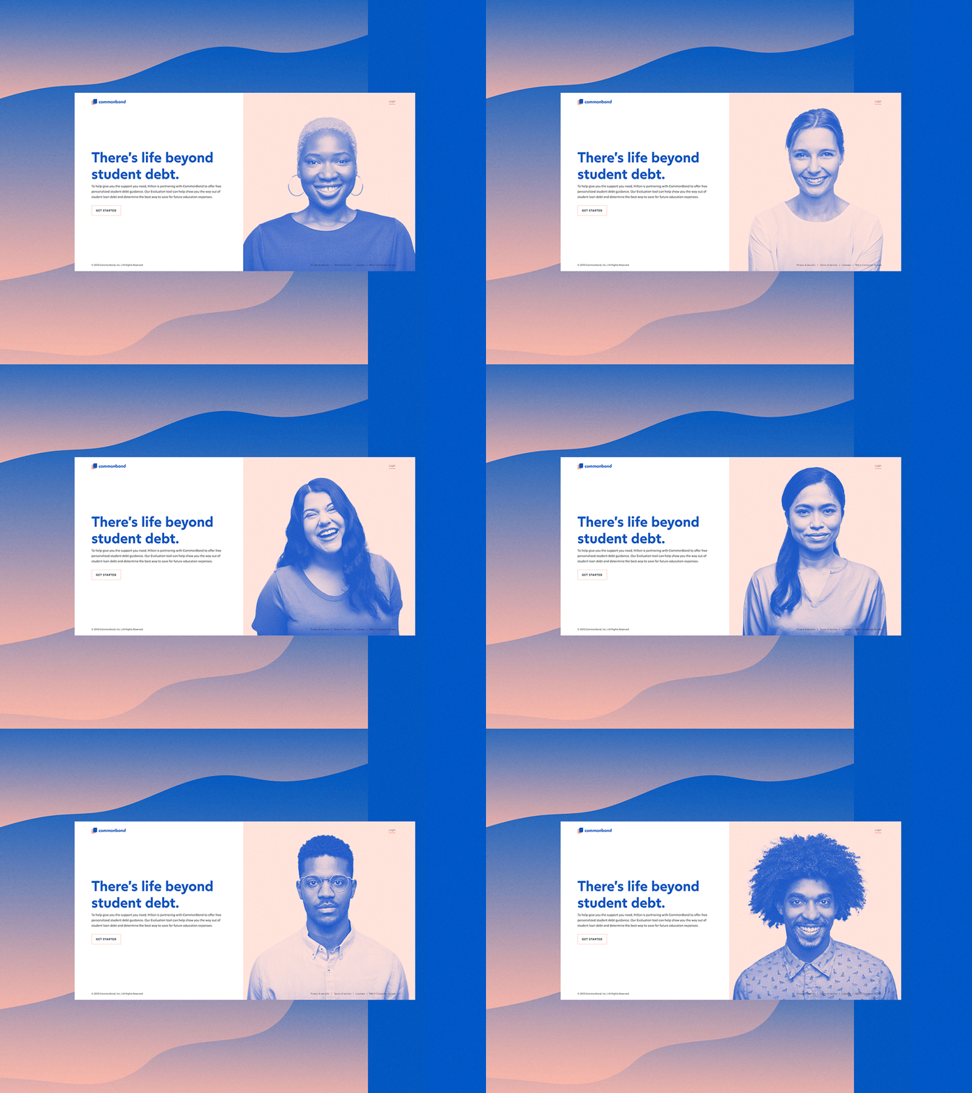
UX: We needed a better system to route users from their HR portals into our product. The previous landing page had a lot more information and a lot of CTAs, which in our research we found was confusing users. So we hyper-simplified the page to keep the focus on the action we wanted the user to take: just get started.
UI: We have a complex product with a lot of different audiences, so we used the imagery on the page to actually play into that. We really wanted to emphasize that no matter who you are, our tool evaluates your unique situation and give you personalized debt guidance. Also I am a sucker for duotone. lol
This is currently undergoing A/B testing. If this tests positively, we'll continue to iterate. I'm excited to share the process with you all!
