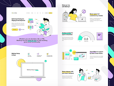
New landing design (Mailtrap, people, new color palette)
Mailtrap setup is easy so is its new main page design: light and bright! I like these soft but vivid colors so much. And I’m glad to introduce the new Mailtrap heroes. They are aimed at helping to inspect and debug your email samples before delivering them to your customers.
Let me know how you like this design and follow Mailtrap on Facebook | Twitter!
More by Railsware View profile
Like

