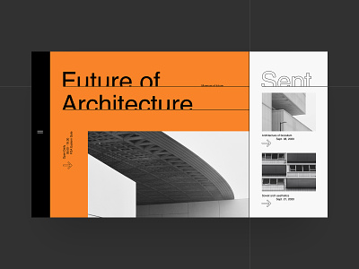
FoA website concept
Hello everyone!
We are pleased to present a new concept for the Museum of Architecture – FoA. Our team continues to experiment with the grid and typography. Here we use contrasts – color contrast, contrast of shapes and sizes, which helps to build content into predictable lines of force. Hope you enjoyed our experiment.
Don't forget to put "Like" 😉
We are open for new project! Email us — info@obys.agency
More by Obys View profile
Like
