AXIS
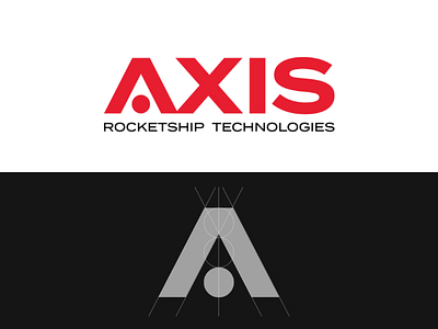
AXIS logo design.
My first project of the second logo design challenge called dailylogochallenge. I really enjoyed working on this logo. It's quite simple, appropriate and memorable. If you look closely at the letter "A" there's a rocketship in negative space:)
I used simple grid system in order to create the letter A and optically aligned the letters.
As primary colour I chose red as it represents passion and strength.
Feel free to comment your thoughts on this logo.
More by Timur Aldemir View profile
Like
