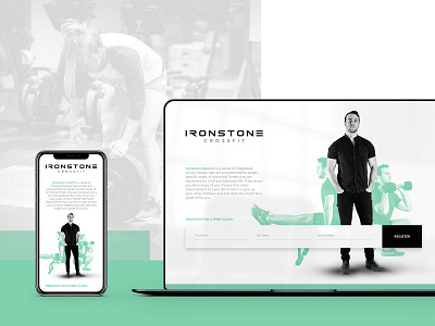
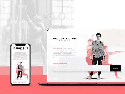
Ironstone Crossfit - Landing Page Design
Landing pages don't have to suck. It's a great opportunity to inject your brands' personality and make it a unique presentation vs. the standard text left, form right that comes with most cookie cutting templates.
------
Project: Ironstone wanted to freshen up their brand world and make it more approachable to the average consumer that might be looking at participating in a Yoga class as opposed to diving right into CrossFit. We worked alongside their team to develop a clear distinction in their marketing materials and help draw a line between their class types.
The end result is a brand world that feels inviting, fresh and way less daunting to the average consumer looking to make healthy changes in their life. Go check them out - they’re amazing people that are truly passionate about what they do 🍃🏋️♀️
------
Connect with us on:
Instagram
Twitter
Need help with a project? Give us a shout

