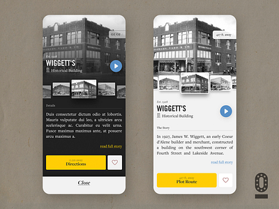
Historik App - WIP Dark or Light
Alright community. I'm looking to get some feedback from everyone on what would display best? A Dark or Light layout? The dark plays well to the consistent black and white images that will be displayed throughout the app, yet the light version is clean and simple. What do you think?
More by Chris Whalen View profile
Like

