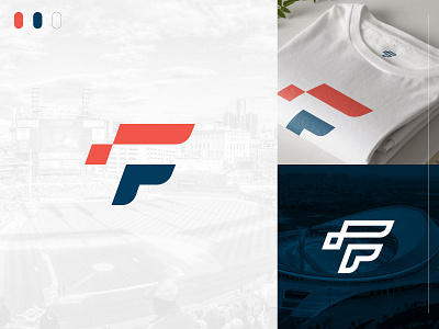
Lettermark "F" Concept 2.0
A second "F" lettermark exploration we worked on for our branding. Leaning more into a sporty feel with good ol' American colors. We also tried to explore how the logo could be reversed out using strokes. This concept didn't make the final cut - as seen by the profile picture ;)
__
More concepts and the final product to come soon!
More by Grant O'Dell View profile
Like

