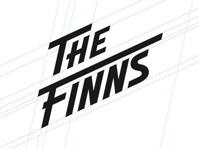
The Finns logo Construction
A deeper look at the design for The Finns logo. I made a slight edit to the E in THE. Thanks to @Urban Influence for making the suggestion to tighten up the E as it was looking larger then the H. :)
More by Kyle Chicoine View profile
Like
