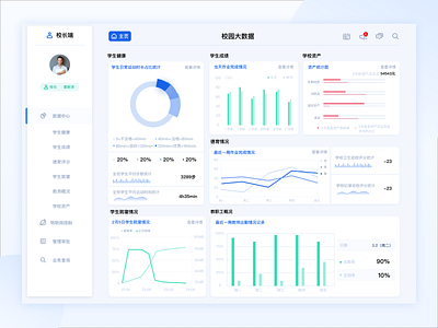
Day 14 Campus management system
Hi,guys!
This is a smart campus project I recently worked on. In order to make the information conveyed by big data more clear, I chose the form of charts and graphs. However, too many charts and graphs will make users more confused when conveying information. Therefore, in terms of presentation methods, text description and charts should be combined to achieve better results.
How do you like it? Eager to hear your thoughts and comments!
Cheers :)
Press "L" to appreciate it
More by Jiuyi Lee View profile
Like
