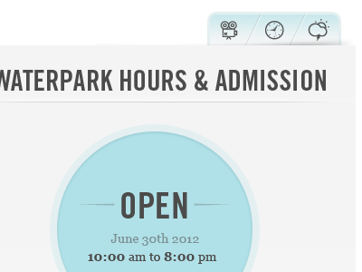
In Progress Hours And Admission Little Nav
Hi everyone, looking for some feedback!
We've been discussing the little nav in the top right of my design. Each icon leads the user to a different page of the site, i.e. the movie projector leads to movie times, the weather icon pops up a window with current weather info, etc. The current plan is to use jQuery tool tips above each as well.
We can't decide for sure if the little nav in the upper right looks too similar to a "tabbed" navigation. More importantly, our main question is, if it does look too similar to tabbed navigation will this confuse users? Would it be better to utilize a nav that doesn't look similar to tabbed navigation? Any feedback is much appreciated. Thanks!
More by Kenny Crippen View profile
Like
