LPC Construction Initial Concept
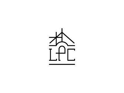
This was an initial logo concept for a Canadian construction company that does modern renovation work using traditional building techniques. The icon shows stick framing on the left, leading toward the completed building on the right. The small serifs on the letters bring to mind stick framing, and the letters together hold up the roof of the house.
The original logo featured an arched window, so I gave a nod to that by making the P in LPC double as a window. This turns the icon into a mnemonic device to help viewers remember the acronym!
We ended up going a different direction, but I loved developing this concept and incorporating the letters into the illustration!