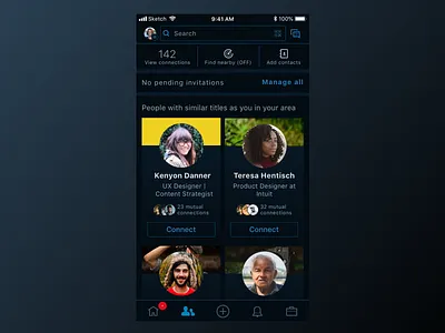
Linkedin Dark Mode— actually Dark-Blue Mode
Since I've been spending a lot of time on Linkedin looking for UX work, and I love dark mode, I thought I would see what a dark mode for Linkedin would look like.
Some changes necessary to keep readability and contrast included increased letter tracking, decreased font-size, thinning out borders, adding subtle background gradients, and removing some borders.
Doing research, I found that Linkedin uses opacity to create different shades in the lettering. Since reading Steve Schoger's, Refactoring UI, I instead used different saturations and tones to select color for the lettering.
Instead of using a true black for the dark mode, I chose to use a color in the same hue as the Linkedin brand color. This way, it gets to retain some of the branding style, but still gets the benefit of a dark mode functionality.
As always, any comments welcome.
Press L for some Love! Thanks!
