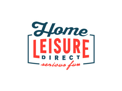
Home Leisure Direct Logo
Incremental update to the HLD logo whilst still trying to swing not having to have a full on solid container (see version attached).
Additions to this include: minimal container keyline with integrated tag line and adoption of brand colours.
Trying hard to keep it as tight, yet simple as possible and keeping feature creep way out of the way.
And yes, that's 4 different fonts we have there. :)
More by Smitho.graphics℠ — Logo & Icon Design Studio View profile
Like


