Mimi
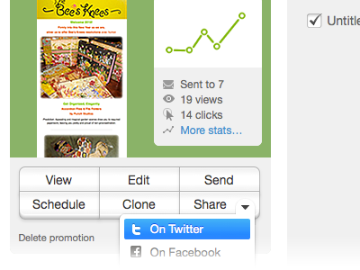
I know the Rogie fanboys will be out in force on this one but I think it just looks cleaner. Totally an opinion. Nothing wrong with Rogie's, just saying I would take it a different direction. And yes, I know the twitter icon is not vertically centered.
I know the effect you're going for is that "Apple" blue style but I like this better.
More by Chris Wallace View profile
Like
