Microtypography
I've been thinking about this a lot these days.
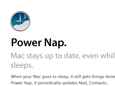
Somehow Apple doesn't look elegant and polished to me no more. Maybe I'm influenced by Steve's death, but here I'm definitely seeing bad font pairing and quick design decisions with little design critique.
Everything looks made on a rush to meet deadlines; I don't get the nice "a-ha!" feeling no more, but a plain "meh".
More by Rodrigo Galindez View profile
Like

