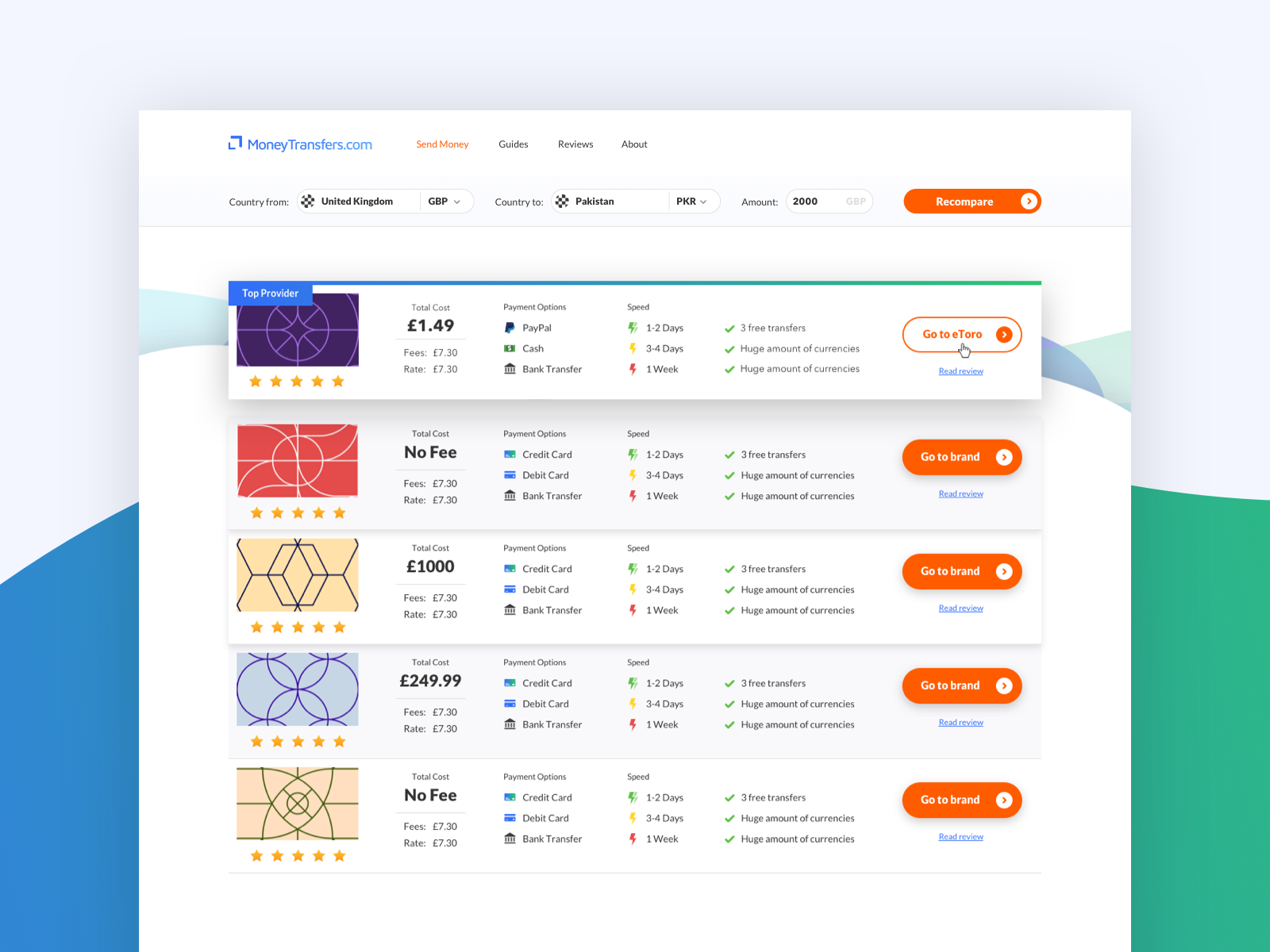
Comparison table UI
Comparison table page for project I’ve been working on.
Top provider needed to stand out and attract attention. Used heavy shadowing to bring the top panel into focus.
Comments more than welcome! Always looking to improve 🤜
More by JClifton Design View profile
Like
