6²
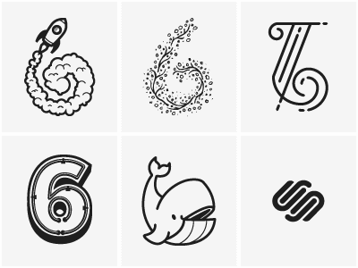
After I heard about the contest I immediately thought 6² (6 Squared). It was a little daunting, but I created 36 lettering treatments for the number "6". They are relatively simple and vary from clean vector compositions to hand-drawn elements. I stuck with the Squarespace branding and used a monochromatic color palette.
The shot cycles through all the treatments and a bigger version is attached to see them all together.
I also created a basic font with all the "6" versions that you can download here.
More by Ryan Putnam View profile
Like


