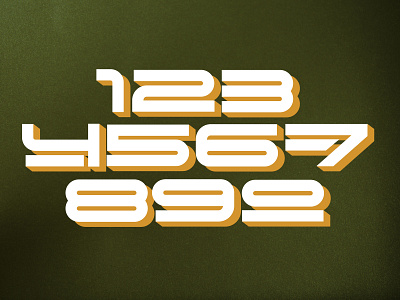
Futuristic Type Exploration
I don’t get too many chances to make custom type and I had a little bit of spare time in between projects so I figured I would mess around and make some numbers from scratch. I tried to hit on opposite vibes by making futuristic type while using a retro color palette/texture. What do you think? Do opposites attract?
•
Let’s work together!
cbcoombsvisual.com for more
More by Charlie Coombs View profile
Like

