Steklo — Sunglasses Store
Hey friends! 👋
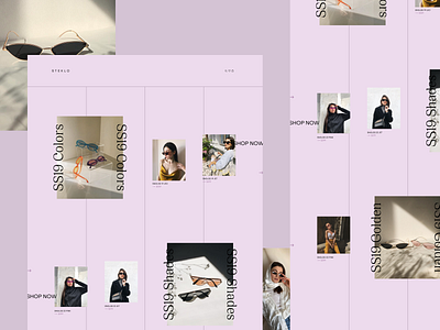
Here at Zajno we don't like putting ourselves in a box, so we always try to experiment and find new solutions. And be sure we had a lot of fun working on this website! It's an online store that sells stylish sunglasses 😎 The design came put pretty unusual, so I decided to share it with you to find out what you think of it 😊
Join our Newsletter for more goodies!
Goals
Creating a fresh, clean and stylish website design to present the products and match the brand's aesthetics.
Approach
I played with the grid and composition trying to find the right layout and better reflect the fashionable style of the store. I used a pastel color palette with some simple geometric elements to match the vibe. I also applied smart whitespace utilization so that the layout seemed lighter and fresher.
Results
We ended up with is a clean and elegant promo page that reflects the store's aesthetics and speaks to their target audience.
What are your thoughts on this one? Share your ideas in the comments down below. And make sure you have a nice day! 🤗
Press "L" to show some love!
ᗈ Join our Newsletter!
ᗈ Website
ᗈ TheGrid
ᗈ Spotify
ᗈ Twitter
ᗈ Medium
ᗈ Facebook
ᗈ Instagram


