Cycling trip. UI/UX Design concept
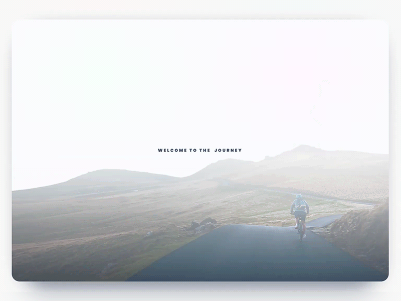
Let me introduce my first shot on this platform for which I was inspired during the journey. A website design concept in a minimalist style, presenting a cycling trip in four countries.
Careful attention was paid to typography and composition, as key sides of user-friendly minimalism enhancing usability, navigability, and visual harmony transferring the spirit of the presented place.
The animation shows transitions between the preload page, the homepage, and the menu to give the feeling of the general design represent.
The accent color has a tone of living coral with a golden undertone, which is the color of 2019 according to experts of the Pantone color institute.
In the following shots, I'll show the rest of the site’s pages and animated transitions between them.
