Design solution for Lenskarts' 3D Ditto
Use case
I recently purchased a frame from Lenskart app. Lenskart has built a 3D Ditto feature to simulate specs on user's face. It's a really good feature to bridge the gap between online and offline spec purchasing. After using it I realised, This feature is a little painful to use.
Usability pain points found in 3D Ditto
1. Bad camera and lighting.
2. Setting Face Position: Difficult for the user to hold their phone at a position. It also takes a lot of time to finalise position.
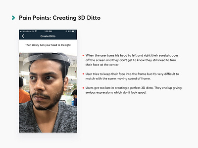
3. Creating 3D Ditto:
a) When the user turns his head to left and right their eyesight goes off the screen and they don't get to know they still need to turn their face at the centre.
b) User tries to keep their face into the frame but it's very difficult to match with the same moving speed of frame.
4. Users get too lost in creating a perfect 3D ditto, They end up giving serious expressions which don't look good.
5. Comparing 3D Ditto with Product Images: User loses their self-esteem when they compare themselves with the model wearing the frame. It happens because of bad lighting, blur image, improper frame fitting and bad expressions on their face.
Design Solution
Try to imagine what people do when they go to buy Specs physically on a store.
They make a lot of facial expressions when they wear specs and look at the mirror to ensure that they are looking good in almost every expression.
Instagram camera filter does the exact same thing. I’ve used it as a simulator which takes very fewer efforts and looks like you are buying specs physically in the virtual world.
I've attached all screenshots with all pain points also. PFA for the same.
Hope you like it!
Please feel free to give your feedback :)


