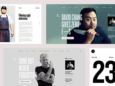
Gastronomy Zine
Hey Guys,
More previews from this project. You can see the typography setup and overall system. How the hero section adapts to different content. There's an underlying grid that's used which I'll share in the next few previews.
Since I always get asked:
KnockOut-Flyweight
KnockOut-Featherweight
Tiempos Headline - Bold
Tiempos Headline - Semibold
-
Learn UI/UX with my design class - Process Masterclass
Learn UX design in depth my class UX Masterclass
Join Verse my weekly newsletter where I share insights about design, entrepreneurship, happiness and my overall journey. (I'm doing a big revamp next year so jump on!)
More by Nguyen Le View profile
Like
