Style Exploration
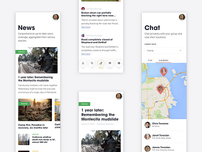

Designing an application to be used in emergency situations requires an intuitive user interface that can be used quickly as well as colors that benefit accessibility and type that is legible at all sizes.
With this in mind, I researched signage, wayfinding, crisis websites and applications, and emergency typography and color palettes to determine how different styles could impact the design of the app. With a better understanding of these design systems in mind, I designed an interface that prioritized legibility, accessibility, and ease-of-use. These components were then applied to key areas of the app to see how they worked together and aligned with the theme.