What up, G
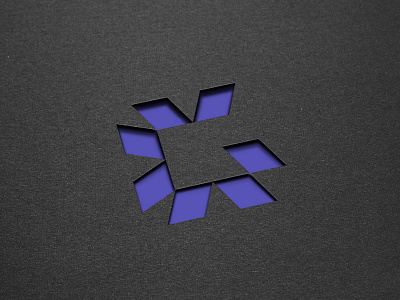
This G represents Galvanize—formerly ACL—a tech company specializing in analytics and enterprise governance, risk and compliance (GRC) management software. This was a lengthy and deep brand strategy, foraying into brand architecture and parent-child renaming evaluation.
My findings evinced brand attributes of opinionated, curious, and savvy via the exploration of dimensionality, structured or geometric visuals, sharp shapes, linework. Because they were changing their company name, my team lobbied for the retention of the unique, differentiating signature brand color of purple, but revised the supporting palette with exploration of bolder secondary colors. Ultimately we wanted the logo to convey the simplicity, elegance, and power of the platform’s user experience, and to feel somewhat disruptive. All the while, though, it had to play in a product sub-brand ecosystem bound to sprout unlimited extensions.
The resultant G-mark is the handiwork of design wizard @Chase Turberville, who pretty much nailed the strategic design objectives. My fave in a long line of cherished, rad work partners at Focus Lab, our mindshare brought about many beautiful brands that I am proud of, this being one of them.
