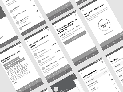
BreatheEasy- Mid Fidelity Wireframes
Due to the tight time frame of this project, I had initial sketches of few screens drawn on a piece of paper and later on started designing the mid-fid prototype on figma, due to it’s strong collaboration feature I was able to get it checked and tested out by my peers and gain constructive feedback at an early stage of the design. I closely followed google’s material design guidelines for a clean intuitive UI.
Checkout the prototype on Invision
----------------------------------------------------------------
Follow me on
Twitter Instagram Behance
If you have a web or mobile app project in mind, or just want to chat, feel free to contact me.
Let's get started
More by Aonnoy Sengupta View profile
Like
