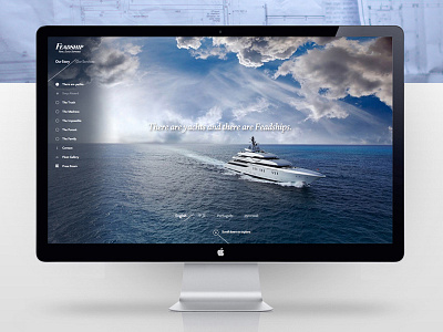
Landing page - menu activated
As part of the design language we established the horizon always had to be centered vertically, and angled lines were to be used to represent the angle of the bow of their yachts. We were developing a ton of content to present on the site with chapters that had sub chapters, including presentations of yachts, the history of the brand and being fully responsive.
Agency: Amsterdam Worldwide
Client: Feadship
Role: Digital art director
More by PYZA View profile
Like
