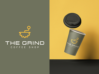
The Grind Logo Identity 2/30
Brief: The Grind is a small coffee shop chain, who prides themselves on natural and local ingredients. They didn't want to use any browns like competitors, but open to other earth tones. They also liked a clean logo style.
Rationale: I took a play on words with the icon being a coffee grinder and a gear, and then using a dark green to talk to the natural ingredients.
More by Luke 'Flurolux' Zorbas View profile
Like
