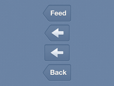
The iOS Back Button
Had an interesting discussion about the Back Button on Twitter the other day. Used the Back Button with the Label 'Back' quite often, not sure why. So I started doing little research to find the best option.
1. Best option, labeled Back Button. Users know where they came from and the button itself says 'Back'. According to Apple a Back Button should be labeled with the previous level’s title.
2. If the previous page has an unpredictable or long title you can use an arrow. The arrow means 'Back' and the Button itself means Back. Apple uses this in their Music app.
3. Fairly close to the second Back Button, also works great. The arrow itself is pretty obvious. So a squared button should be fine.
4. Back Button with 'Back' label. I think you should never use this. The label has no context that adds anything to the button itself. Apple never does this.
