Rapture | Innovation Personified
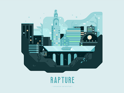
This week's illustration (albeit a bit late) is about one of my favourite video games, Bioshock. And what better place to showcase this than the utopia-gone-wrong, Rapture.
.
I felt like the color palette was in the right direction, I was going for that faded blue, turquoise look. However, I do feel that parts in the middle started to blend in too much into the background and made the illustration a bit muted and low-contrast.
.
I enjoyed crafting the composition of the illustration, originally starting off with researching a bunch of art-deco era buildings, obviously drawing inspiration from both the game and real buildings like the Empire State building. I think what ties the illustration together for me is adding that tube and submarine to really capture that underwater vibe.
.
What do you guys think? How can I improve the colors on this one? Would love to hear your thoughts.
Twitter: https://twitter.com/FarrelNobel