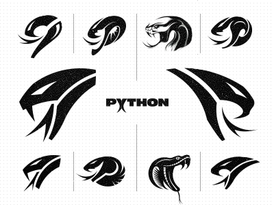
Python Safety - Logo Design Concepts
After a bunch of sketches and about a dozen of iterations, the client has made a decision. Part of the reason why they chose one of my earlier concepts - as shown large on the left - was because the earlier iteration just stuck better with everyone on the team. Despite many of my attempts to correct a bunch of technical imperfections, they simply wouldn't allow me to make any more changes and stick with the earlier one instead - again shown large on the left ;)
After I dug deeper into my ideas and a few attempts trying to push my favourites - as shown large on the right and bottom right - they gave me a light-hearted kick in the pants to send me on my way to wrap this thing up in order to move on to the next episode of their brand identity project: typography within the next month.
So far so good. No matter how many variants I can poke a pencil at, it just won't work when everyone on the team feels comfortable with the other. And chances are that it will do the same with their audience too.
