Sticky Mobile Menu
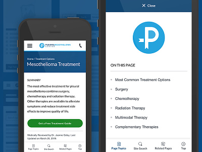
During our site redesign I tackled a problem where important navigational items were being buried and hard for our mobile users to find. Our related pages were just collapsed to the bottom of the site and most users never even knew they existed. We also needed to display the topics on the page so that users could quickly find what they were looking for.
To solve the problem I borrowed a behavior mobile users were already accustomed to from the app world, a sticky menu. By placing it on the bottom users can effortlessly toggle between page topics, search, and related pages screens with their thumb.
More by Eric Rodgers View profile
Like
