The Bach
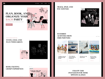
Today's post is a concept layout we designed for BACH Party App.
BACH came to us to solve the issues they were having with their composition. In this layout, we tried to come up with a new fun approach for their website. We designed it so that the user would feel immersed in the site, so that information was delivered in a clear hierarchy, to eliminate clutter, and to highlight the illustrations on the site.
See more of our work at https://www.checkmate.digital/.
More by Derek Yepes View profile
Like

