Lettering Merge
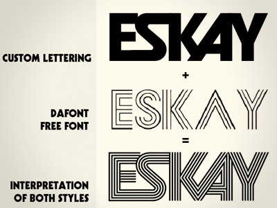

A recent opportunity presented itself when a client gave me a screenshot from a font from Dafont while showing interest in one of the custom lettered proofs I did. It's not uncommon for clients to ask for a happy medium between two proofs or styles. The two were close enough in style (geometric, bold, 70s inspired photolettering) that I really got "on board" with the request. I came up with the bottom logo as a solution to redraw the lettering and combine the styles without compromising the aesthetics of the original proposed logo (top). Let me know your thoughts...
