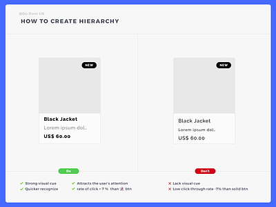
Do Don't UX - How To Create Hierarchy
Hope you like it! Press "L" on your keyboard and follow me to not miss upcoming advice.
Use color and weight to create hierarchy instead of size
"This text is important?" Let’s make it bolder.
“This text is secondary?" Let’s use a lighter color.
Try and stick to two or three colors:
A dark (but not black) color for primary content
A grey for secondary content
A lighter grey for ancillary content
More by Do Don't UX View profile
Like
