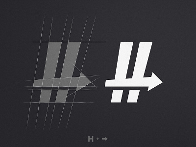
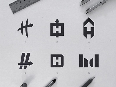
Hashdash - Grid Design
There is something very important that i see a lot of Logo Designers overlook - and that is how much it matters to have a logo on the correct background - either it be light or dark. Let's say this mark for example, it's true beauty is seen on a dark background because the gaps below the arrow turn into shadows, making the arrow subtly pop. By the way, this logo is my favorite of the month, can't wait to show you the full brand identity! Stay tuned 👊
More by Wisecraft View profile
Like

