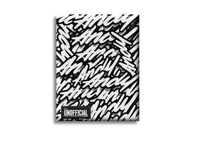
Lettering, daily
This was a veryy cost effective design I put together this afternoon. Black and white to save the 30%, added the 3d effect on the boarder, dropped a shadow, left a small a few inches for the margin so I wouldn’t lose any of those effects and printed out on the cheapest option for paper. Besides, they’re just going to get wheat plasted. I mean, framed 🙊
More by Andy Celis View profile
Like
